Designing a living room is highly personal. It should speak to you and about you. The living room represents your personality and your perception of the world around you. You are as happy as the people and environment around you. A well-designed and decorated living room speaks a lot about you. Your living room should be inviting and comfortable enough for you to have a nice time with your friends and family. It is a place where your mind should be at ease and brings you inner peace. Read our previous blogs on Living Room: Design Tips and Tricks and Living Room Styles to gain more insight.
In case you are struggling to make your living room well-designed and complete, give us a call at +91- 9892343410 and our team of professionally qualified interior designers will be happy to take over all your design worries. The living room is the most used room of the house and balancing décor with functionality is often a tricky business. People often try to cut corners and attempt to design their living rooms themselves. Though it is not bad to express your creativity, many times people end up over-crowding or mismatching the color combinations. Interior design is an art and a complex process. And trust us, at Elevation Interior, we make sure that vision comes to reality, without making it look misplaced. Also, we value your time and money.
Still, we consulted our team of experts and they jotted down some of the common mistakes people make while designing their living rooms:
Scale and Proportion
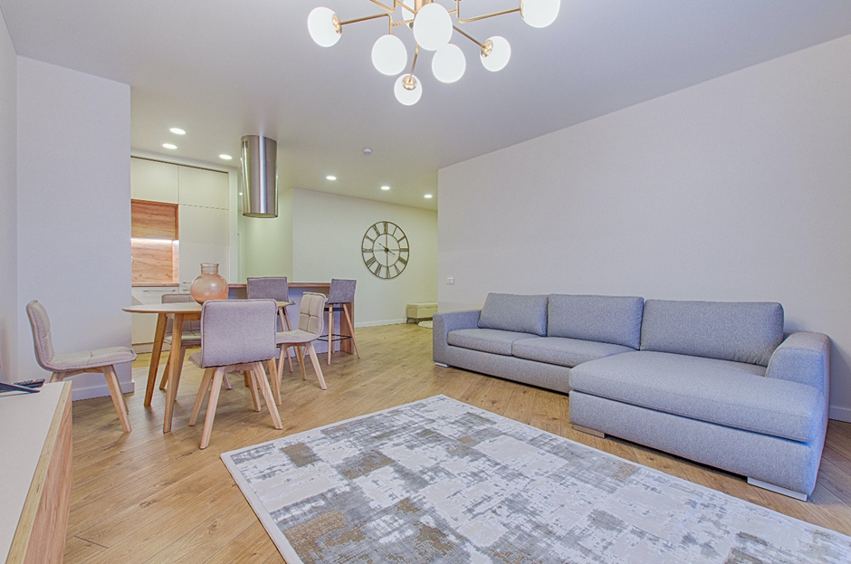
The most common mistake people make while designing a living room space is not measuring the size of the room. It is very important to have the exact measurements. People rush to buy a new sofa set or a coffee table or a dining table without figuring out the size and shape that would best fit their living room. The end result is that either the furniture is too big or too small for the space. Another important aspect is, often when people try to upscale old furniture, scale and proportion are thrown out of the window. This makes the room look clustered. Choose furniture, especially a sofa set, that is according to the fit of the room and make sure it is comfortable enough for you to enjoy it.
Placement Planning
Before making a commitment to any big furniture item, do placement planning. Do a little scouting, and finalize the furniture you want, but before spending your hard-earned money, make a sketch of where are you going to place it. Does your mental picture resonate with reality? Choose a focal wall, this wall should be where your main sofa should be. If the space is small, you can push it against the wall but if you have a larger space, we suggest leaving a little gap between the wall and the sofa. What elevates the room here is how you float the rest of the furniture pieces in the remaining space. The other pieces of sofa, whether it be armchairs or single seater sofas, should be so placed that it faces the largest piece of sofa set in your room. It should be at an angle that is comfortable enough to have a lively chat with your guests and make eye contact.
Rugs
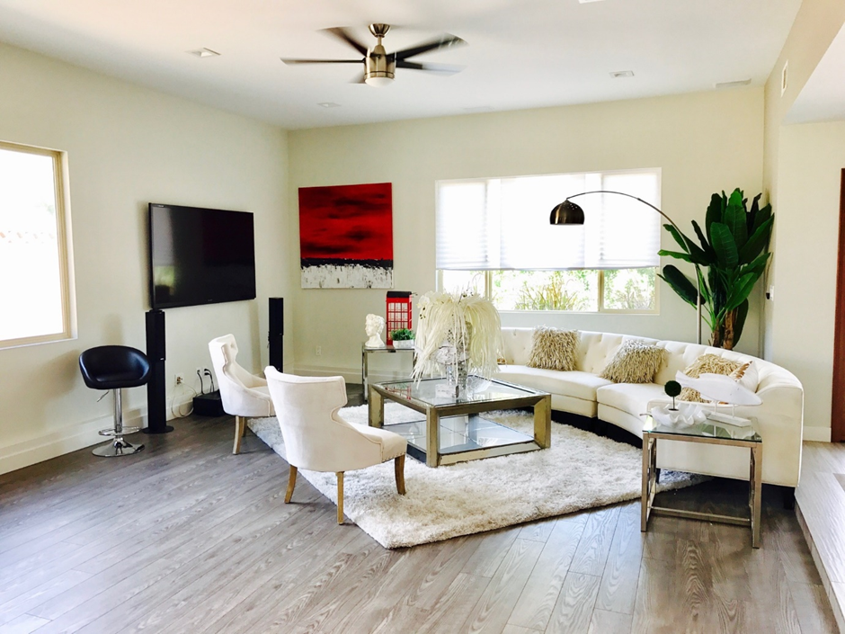
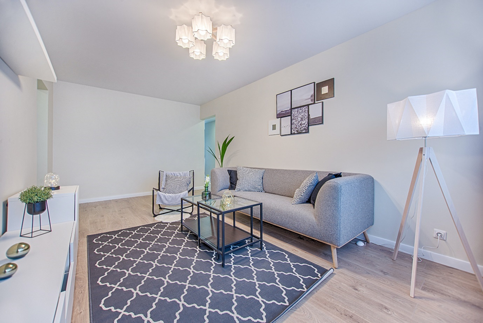
Invest in rugs. They are a style statement. And don’t shy away from buying a rug that is of good quality and appropriate proportion to the room. They make the room look bigger, cozier and more intimate and also add to the aesthetics of the room. In our country, you would see ‘n’ a number of traditional designs available in the market. But when we mention rugs, we don’t necessarily mean those age-old traditional rugs. A modern minimalistic house with a traditional rug would look weird. However, in the case of a traditional living room, it would be perfect. The rug should match the style of your living room.
Focal Point
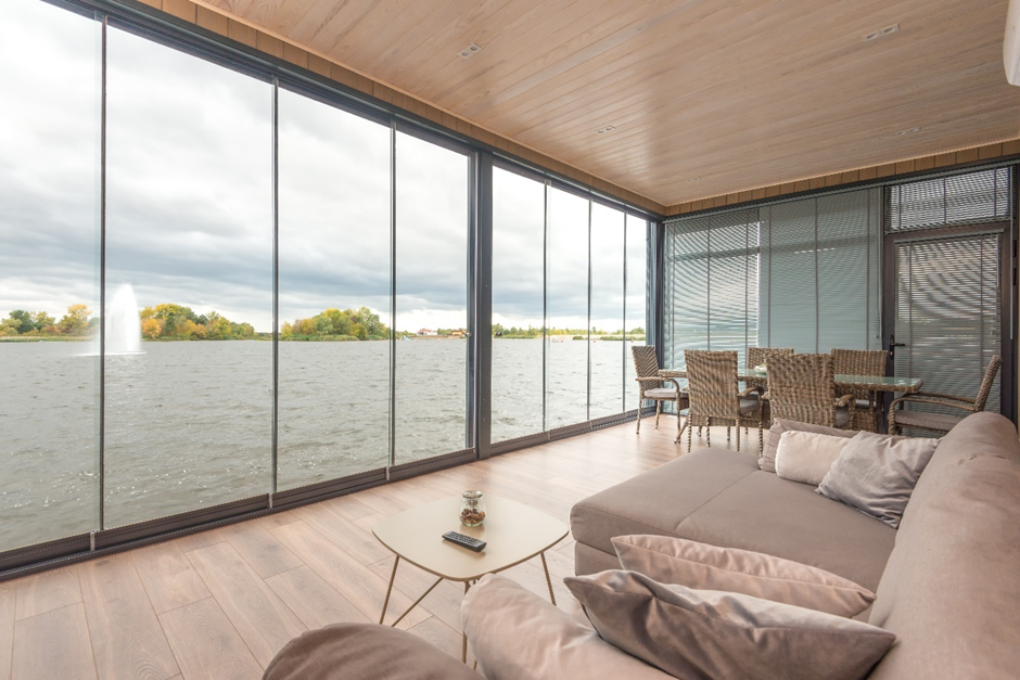
Decide the focal point of your living room. What is the main attraction of the room? Is it the mesmerizing view from your window? Or is it the collection of art on your wall? The furniture doesn’t always have to face the TV set. It should maintain a balance between the functional aspect as well as aesthetic aspect of the room. The purpose of a living room shouldn’t always be watching TV. Sometimes you want more, like just looking at the view from your window and sipping that hot cup of cocoa. Engagement with others should be more of a purpose here.
Catalog Living Rooms
How many of you have looked at the picture of a living room from a furnishing magazine with those matchy-matchy sets and gone, “Hey! This looks good”. Honestly, we have. But what we have learned from our experience is that it is a mistake. Don’t copy a look from a catalog. Yes, they do look appealing but think for a moment, how many others are also seen in the same catalog. They are very easy to copy. Your living room should be your vision, and not somebody else’s. It is you who has to live in that house, not your interior designer, not the guy who took the picture and definitely not the guy who printed the magazine. Sit down with our design team at Elevation Interior, convey your thoughts and watch your experts convert your emotions into reality.
Curtain Rods
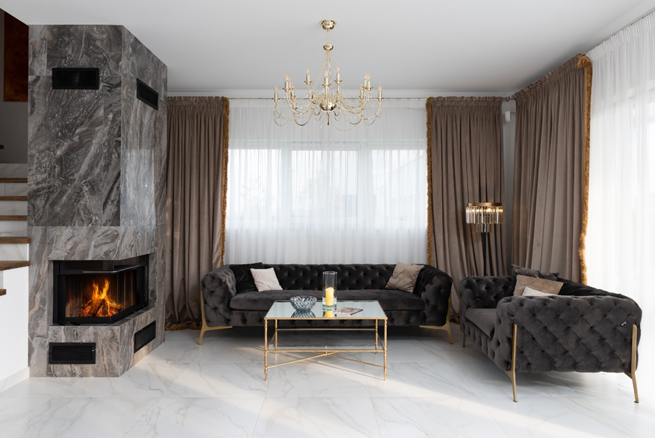
Another very common mistake people make while designing their living room is the measurement and placement of curtain rods. Neither should your curtains be too high up from the floor nor should they be so long that they gather dust from the floor. Before placing the hardware, make sure you have the accurate measurement and you have decided whether you want the curtains to hang on the window frame or be a little extended. About 3 inches on both sides of the window is usually enough, however, it would be different as per the space available. Also, don’t put the curtain rods below the window frame. The placement of the hardware should be 4 inches above the window.
Surface Space
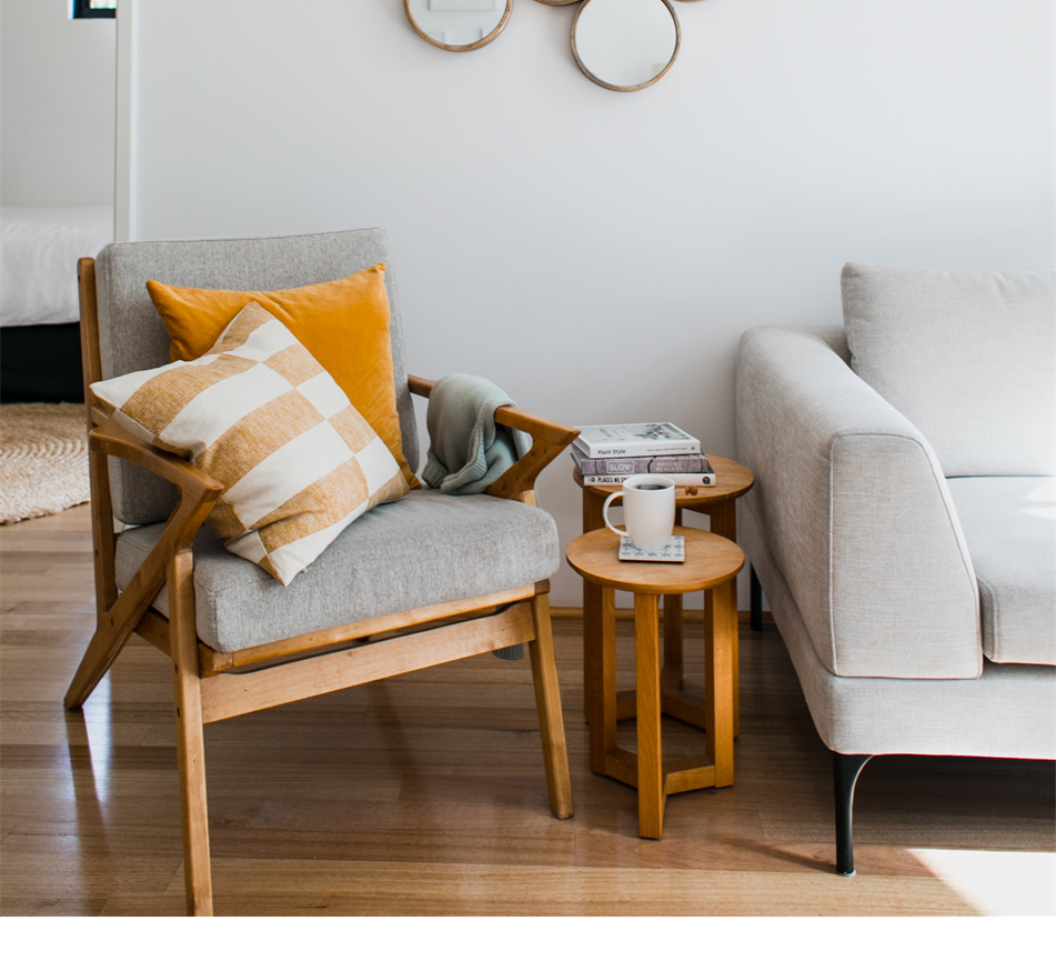
What is surface space? Let us try and explain it in simple words. Everyone seated in the room requires some space near them, which they can use to place their drinks or keys or have access to the food. This space is called surface space. Most of the time this need is fulfilled by a centre table or a coffee table. But in the case of a large space, we may have to add some extra surface space, so that your guests don’t have to get up from their place again and again to have access to something they need. This can be easily fixed by putting a slim sofa console behind the sofa or by putting an end table by the side of the sofa.
First impressions sometimes make the last impression and we are sure you would like for it to be a positive one. Make a strong first impression with services from our trained interior designers in Thane, Mumbai. Call us at +91- 9892343410 or email us at info@elevationinterior.com. Have peaceful and enjoyable social gatherings in a well-designed living room by Elevation Interior. We are proud to announce that you can avail of our services in Thane, Navi Mumbai and all over Mumbai. For more information about our upcoming blogs, follow us on Facebook at https://www.facebook.com/ElevationInterior. You can also visit our website at www.elevationinterior.com.

Well written and it points out very specific issues in designing your living room.